Interpreting covid case rates with R
I quite enjoy tinkering with data, and the sheer amount of it that the global response to covid-19 has produced gives us a number of rich datasets to explore. In this blogpost I’ll try and set out my adventures in the R statistical programming language to plot the covid case rate in England onto a graph.
To do this I’m using RStudio which is free software available for the Mac (which I use), Windows and Linux, along with the ggplot2 package within R. I don’t have the expertise in any of this to provide a particularly good tutorial in either R or RStudio but there are countless guides, YouTube videos, books and so on available. This is simply the story of my own travails, partly to serve as an aide-memoire but also in the hope that someone else could find it interesting.
I will try to recreate the process of discovery I stepped through on a bank holiday afternoon. I’m conscious that might not be terribly helpful in terms of working out how the underlying code ends up so I’ve published it over on Github in case you would like to see it
Finding some data
First, I need a dataset to work with. Thankfully the Public Health England covid data is easy to obtain from https://coronavirus.data.gov.uk, and the download page allows you to build a URL you can use again and again. Here, I’m using the following parameters (all selected from dropdowns) to build my permanent link:
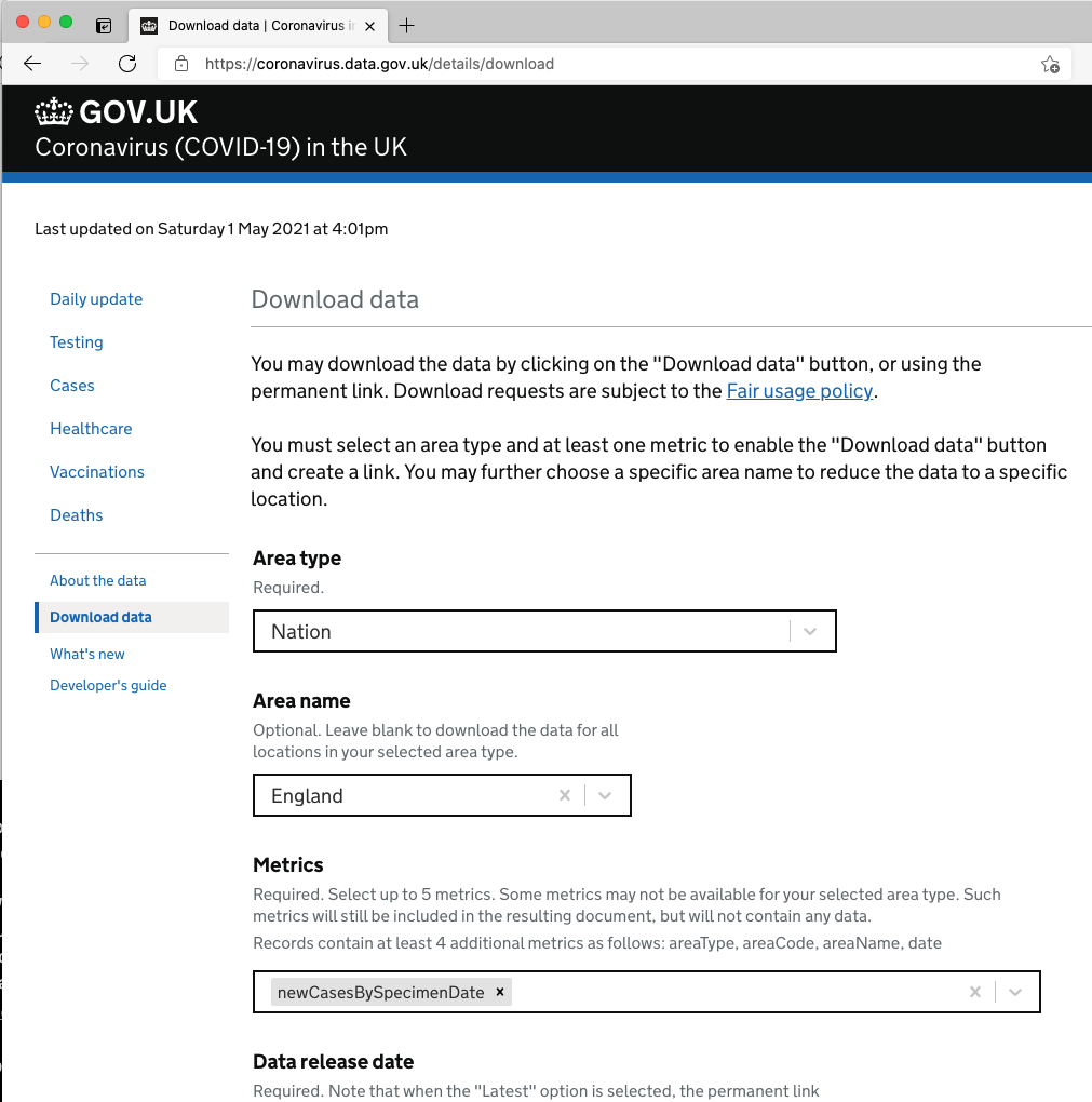
| Area type | Nation |
|---|---|
| Area name | England |
| Metrics | newCasesBySpecimenDate |
| Data release date | Latest |
| Data format | CSV |
As you select each parameter, your permanent link is built for you below. Here’s mine, based on the selections I made above:
<a href="https://api.coronavirus.data.gov.uk/v2/data?areaType=nation&areaCode=E92000001&metric=newCasesBySpecimenDate&format=csv" rel="noreferrer noopener" target="_blank">https://api.coronavirus.data.gov.uk/v2/data?areaType=nation&areaCode=E92000001&metric=newCasesBySpecimenDate&format=csv</a>You can visit this link in your web browser; it’ll return a CSV file which you can load in a spreadsheet package such as Excel, or Google Sheets and manipulate it that way if you like.
Into R
As I start writing my R code I need to do a few things: first, I need to load the ggplot2 library to enable me to plot some nice looking charts. Second, I need to load my dataset using the URL we built above. And third, I need to plot the data into some sort of meaningful form.
# LOAD LIBRARIES ----

library("ggplot2")

# IMPORT DATASET ----

covid_cases_csv <- read.csv(url("https://api.coronavirus.data.gov.uk/v2/data?areaType=nation&areaCode=E92000001&metric=newCasesBySpecimenDate&format=csv"))
A couple of things have happened here. First off, I’ve loaded ggplot2 as mentioned just above. I’ve also created a variable, covid_cases_csv into which I’ve dumped the covid case dataset by way of the read.csv command which uses the permanent link I got from Public Health England as an argument.
Having run this code I don’t see any particular errors, but I want to make sure we’ve loaded something that R can work with. If I issue the command head(covid_cases_csv) I get back the following:
   > head(covid_cases_csv)
      areaCode areaName areaType       date newCasesBySpecimenDate
   1 E92000001  England   nation 2021-05-02                    674
   2 E92000001  England   nation 2021-05-01                    991
   3 E92000001  England   nation 2021-04-30                   1343
   4 E92000001  England   nation 2021-04-29                   1836
   5 E92000001  England   nation 2021-04-28                   2134
   6 E92000001  England   nation 2021-04-27                   1805
Excellent! We have a working dataset I can use to create a plot. I’ll now issue the following command - am I going to get a beautifully formatted plot?
ggplot(covid_cases_csv, aes(x = date, y = newCasesBySpecimenDate))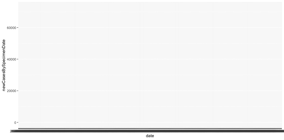
Not quite. I do get an x and a y axis, a few case rate tickmarks and a great many date tickmarks but that’s about it. I need to add what’s known as a geom to actually see any data. I’m also going to create a second variable, covid_cases_plot to hold my ggplot command to make it easier to work with later.
# PLOT DATA ----

covid_cases_plot <- ggplot(covid_cases_csv, aes(x = date, y = newCasesBySpecimenDate)) +
   geom_point(shape = 1, colour = "red", size=2)

covid_cases_plot
So now my new variable is a receptable for the ggplot command. With the plus mark I can also add the geom_point command to plot my data. And finally, I call my variable to execute the plot.
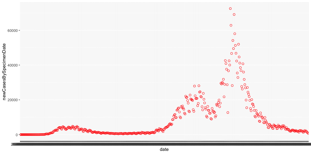 We have some data! We also have a few things to fix, the first thing being the slightly odd date format in the underlying data that ggplot is clearly having trouble interpreting. I’m going to add a couple of lines to my script just after I populate my covid_cases_csv variable which will rewrite the data to a slightly easier format:
# FORMAT DATA ----

covid_cases_csv$date = as.Date(covid_cases_csv$date, "%Y-%m-%d")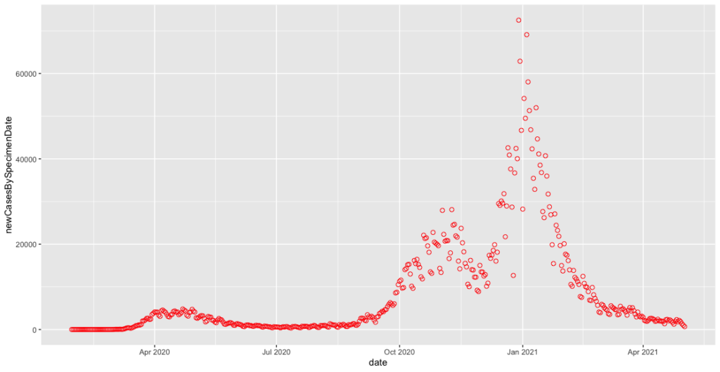
That x-axis immediately starts to look better.
Zooming in and smoothing off
Because I’m mainly interested in the case rate change we’re experiencing in 2021, there’s a lot of early data I can eliminate. I also want to calculate a seven-day average to remove some of the noise in the plot and make patterns easier to establish.
To cut out data prior to 1st November 2020 I need to change my ggplot command to introduce a conditional which argument in square brackets, effectively cutting my plot down to “dates greater than 1st November 2020”:
covid_cases_plot <- ggplot(covid_cases_csv[which(covid_cases_csv$date>"2020-11-01"),], aes(x = date, y = newCasesBySpecimenDate)) +
   geom_point(shape = 1, colour = "red", size=2)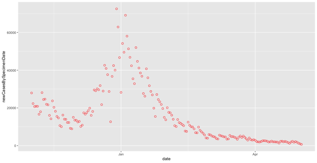
We can now see the familiar shape of cases dropping off over the November lockdown, only to rise again through December and January. At closer range this is even noisier, so we want to implement the seven day rolling average to calm it down a little. This requires us to add two more libraries, dplyr and zoo to enable us to manipulate the data further. I therefore add the following lines to the # LOAD LIBRARIES section of my script:
library("dplyr")
library("zoo")
Next, I add an additional parameter to my # IMPORT DATASET section:
covid_cases_csv <- read.csv(url("https://api.coronavirus.data.gov.uk/v2/data?areaType=nation&areaCode=E92000001&metric=newCasesBySpecimenDate&format=csv")) %>%
   dplyr::mutate(cases_07da = zoo::rollmean(newCasesBySpecimenDate, k = 7, fill = NA))
Here I’ve used a function of the dplyr library called mutate, and a function of the zoo library called rollmean to create a 7 day rolling average of the newCasesBySpecimenDate column in my dataset. This produces a value I have named cases_07da and we now need to make sure we plot this on our y axis instead of newCasesBySpecimenDate. Again we change our ggplot command:
covid_cases_plot <- ggplot(covid_cases_csv[which(covid_cases_csv$date>"2020-11-01"),], aes(x = date, y = cases_07da)) +
   geom_point(shape = 1, colour = "red", size=2)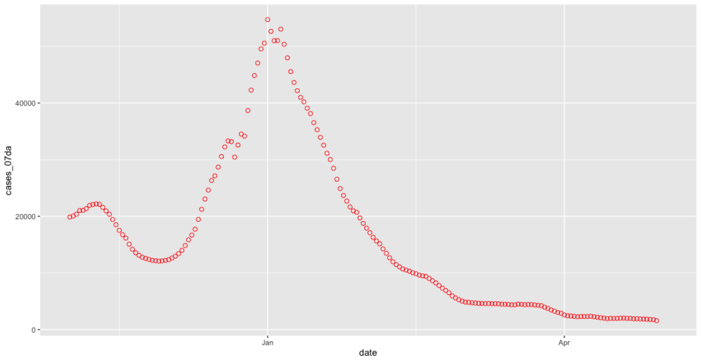
Off to the logging camp to see about a dangling end
This is starting to look a lot better. However, the linear scale doesn’t really help us chart the case rates given the low levels of the disease present in the UK at the time of writing. A log scale will show this in a rather better way. Let’s add an additional argument to our final line where we call the covid_cases_plot variable:
covid_cases_plot +
   scale_y_continuous(trans = 'log10', breaks = c(1000,2000,5000,10000,20000,50000))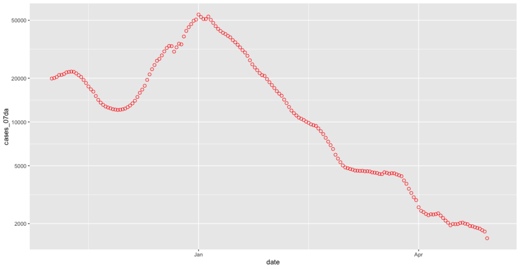
Now we can see much more easily what’s going on at those lower levels. This improvement has highlighted however a further problem inherent in the “cases by specimen date” dataset, which is that the numbers for each day can be revised upwards as new test results come in. This can theoretically happen at any time, although as Richard @RP131 shows us daily on Twitter this is usually pretty stable after five days:
Chart for monitoring lag in reporting of England positive test results. Each column represents a given day's report and shows which specimen dates it covers. pic.twitter.com/2eyrHOkaJG
— Richard 📊📉 (@RP131) May 3, 2021
What we therefore want to do is not plot anything from the last five days. It was not immediately obvious how to do this until I discovered R’s Sys.Date() command which returns the date in a way which allows me to perform a simple subtraction on it:
less_recent_days <- Sys.Date() - 5If I return again to our ggplot command, I now need to add a further statement to my which argument to allow us to cut off the date range at both ends:
covid_cases_plot <- ggplot(covid_cases_csv[which(covid_cases_csv$date>"2020-11-01" & covid_cases_csv$date<less_recent_days),], aes(x = date, y = cases_07da)) +
   geom_point(shape = 1, colour = "red", size=2)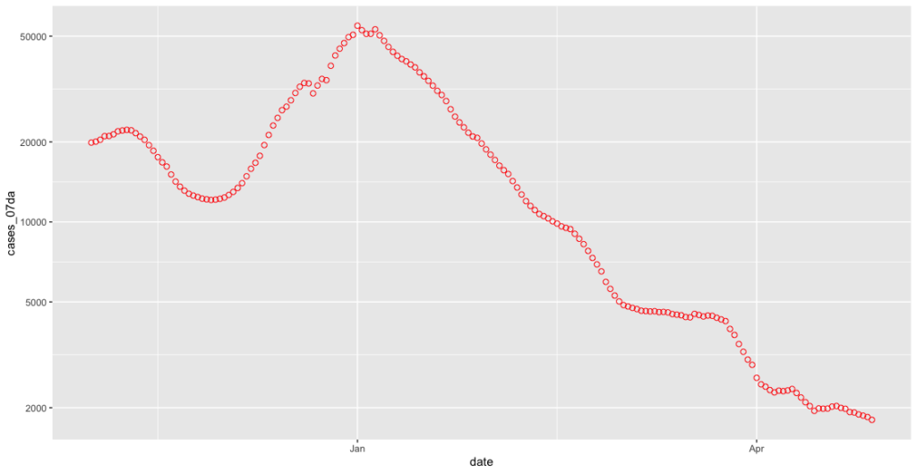
That dangling tail has now disappeared!
Trends and ting
Now we don’t have any artificially low rates to concern ourselves with, we can have a go at plotting a reasonably current trendline. This is done in ggplot using a geom called geom_smooth. As we’re looking at a seven day rolling average I’ll use a seven day trendline as well. To figure out the date seven days back from five days ago (remember we’ve chopped off our dangling ends up above), I’ll simply use the output of my less_recent_days variable like so:
less_seven_days <- less_recent_days - 7The geom_smooth gets added on after the geom_point command. Using the subset argument and our less_seven_days variable we can make sure we only track the trend for the period of time we want. The method of “lm” gives us a ‘linear smooth’, or a straight line.
covid_cases_plot <- ggplot(covid_cases_csv[which(covid_cases_csv$date>"2020-11-01" & covid_cases_csv$date<less_recent_days),], aes(x = date, y = cases_07da)) +
  geom_point(shape = 1, colour = "red", size=2) +
  geom_smooth(data=subset(covid_cases_csv, covid_cases_csv$date >= less_seven_days), method = "lm", colour = "black", size=0.5)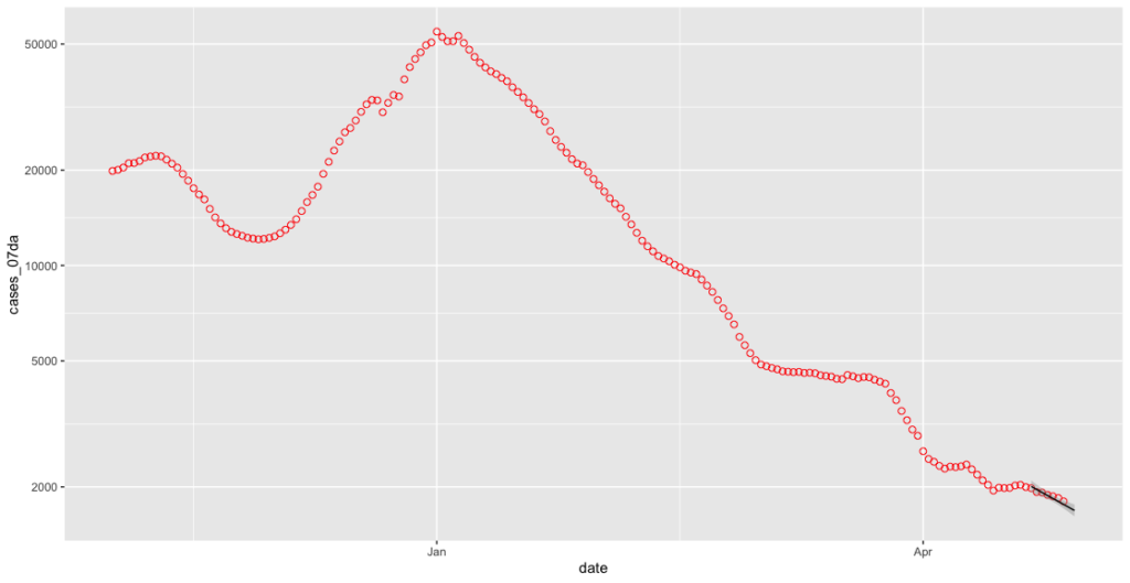
That’s certainly a line, but it’s not terribly easy to see. Let’s use an argument called fullrange to extend it out a bit.
geom_smooth(data=subset(covid_cases_csv, covid_cases_csv$date >= less_seven_days), method = "lm", colour = "black", size=0.5, fullrange=TRUE)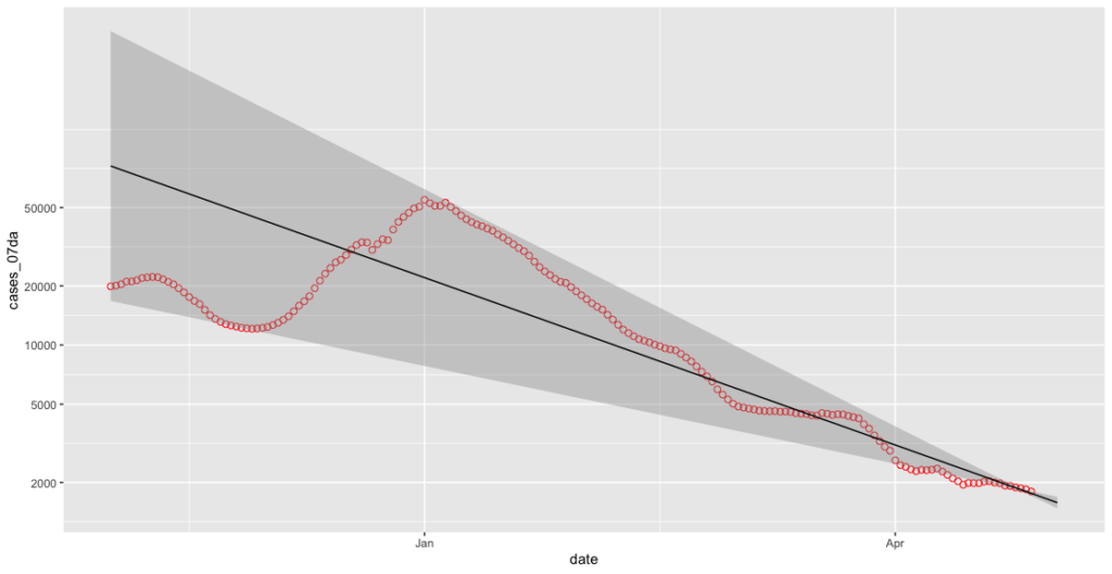
Oh, balls. We can now turn off the grey smoothing effect as it’s buggering our y-axis up.
geom_smooth(data=subset(covid_cases_csv, covid_cases_csv$date >= less_seven_days), method = "lm", colour = "black", size=0.5, fullrange=TRUE, se=FALSE)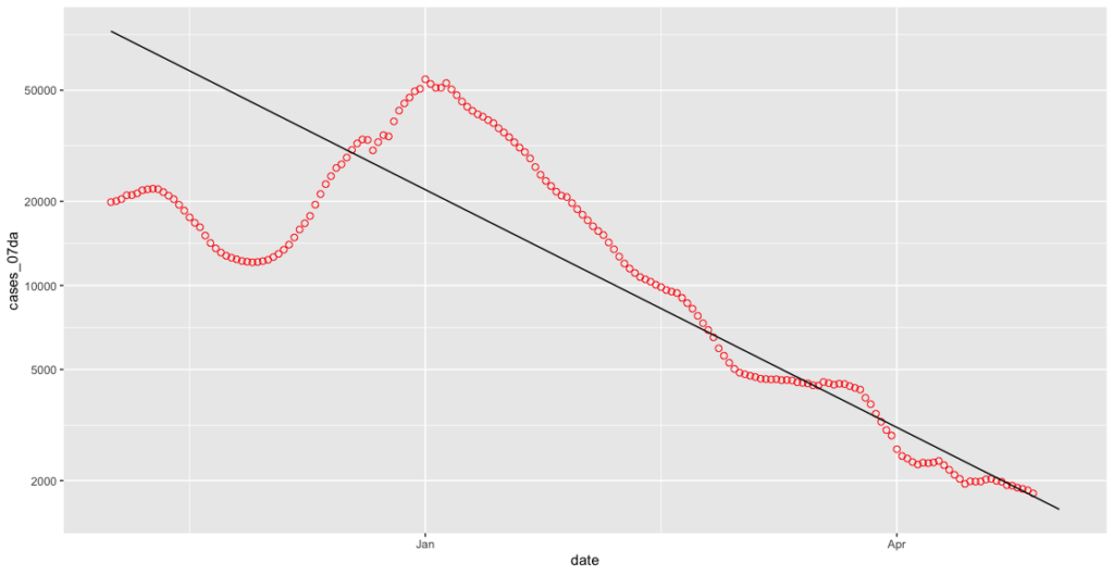
That’s better!
Tidying up
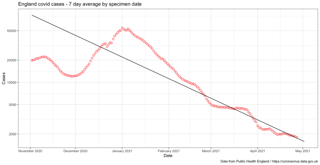
We now have a useful data plot, however it’s still a little rough around the edges. If I add some additional arguments to the final calling of the covid_cases_plot variable I can neatly label each axis, make sure the x-axis shows each month as a separate tickmark, add a title and finally change the style of the plot:
covid_cases_plot +
   scale_y_continuous(trans = 'log10', breaks = c(1000,2000,5000,10000,20000,50000)) +
   scale_x_date(date_labels = "%B %Y", date_breaks = "1 month") +
   ggtitle("England covid cases - 7 day average by specimen date") +
   xlab("Date") +
   ylab("Cases") +
   theme_bw()
I also add a further argument to my ggplot command to credit PHE for the data:
labs(caption = "Data from Public Health England / https://coronavirus.data.gov.uk")The final product looks something like this, which I’m pretty pleased about to be honest:
I’ve yet to decide whether or not I do anything with this data - I might try and have a look at doing something similar at a county level for my local area but I’ll leave that for another day.
The end product
I don’t think I’d ever recommend anyone uses any sort of code I’ve written, but if you’re curious about how these various snippets of code ended up you can see them over on Github.