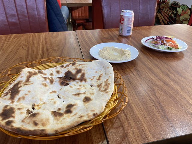
After the roast beef (never t*rk*y) excesses of Christmas Day, I’m out of the house on Boxing Day and looking for a late lunch. I desire curry, but something different from the usual BIR fare one finds is omnipresent round these parts.
Smile Grill (121 Charminster Road, Bournemouth BH8 8UH) is one of those pizza-kebab-burger-curry joints that are relatively common in many parts of the UK but the curry element is a bit of a rarity on the sunny south coast, us spice lovers having to satisfy ourselves with BIR establishments all serving variations on the usual offerings. Smile is set apart still further by being an Afghani outlet. My hopes are high.
On entry, I note a series of tables to the left, all occupied bar one. I catch the eye of one of the numerous staff and point to it, receiving an affirmative nod. The menu is laid out on an illuminated sign above the counter, and I engage what turns out to be mein host to place my simple order – lamb curry and rice. What rice? The options are pilau and “Kabul rice”. This joint is busy and while I would like to question mein host what goes on in Kabul rice I opt for pilau. Would I like bread? Oh, go on then.
Taking my seat I further observe a Tardis-like back room that seemingly swallows up all the subsequent arriving customers. The tables are bare, bar a selection of condiments that I did not investigate. Behind the counter, the various curry offerings are visible along with a rotisserie cabinet and the usual elephant’s legs.
A waiter appears with a single naan bread, a small plate of hummus and a courtesy salad. The bread is served whole and is pleasantly blistered – I sacrifice some to the hummus and find both to be enjoyable. My rice follows, studded with sultanas and embedded with strips of carrot. With that, the main event arrives.
This is most certainly not a BIR curry. Lots of small – boneless – pieces of lamb in something that is decidedly more masala than shorva. I note visible oil separating around the edges of the dish. I decide to adopt a two-pronged method of attack, digging into the masala with the bread and transporting the meat over to the larger rice plate.
The bread is both crisp and slightly chewy – perfect – and collects the masala well. The lamb is soft, not to the point of falling apart but needs minimal persuasion. The spice level is decidedly medium but is certainly enjoyable – I had not asked for any customisations so this was fine. The rice was delightful, bouncy and with a fruity twang thanks to the many sultanas.
My only gripe is that the food could have been slightly hotter, although this was not helped by my being slightly in the draught of the constantly opening-and-closing front door.
The price of this Boxing Day feed – including a Diet Coke – came to the princely sum of £11.00 which I was more than happy to hand over to mein host at the counter on departure.
Would I return? Most certainly – I want to investigate the alternative Kabul rice, and to enquire at a quieter time about the possibility of customisation. I also want to have a go at what appears to be a lamb shank biryani. A la prochâine!
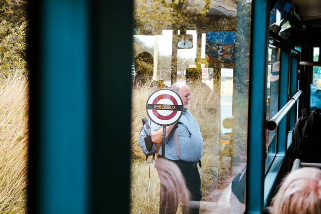
The 23A is a bus service that runs once a year from Warminster to the middle of nowhere, via a village where nobody lives. The fact that it resembles a TfL bus route, with Routemasters, Boris Buses and proper TfL bus stop flags makes it all the more incongruous.
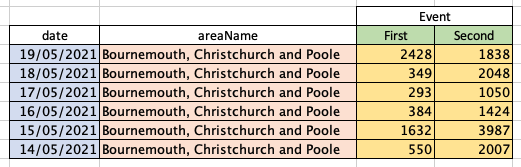
In the course of learning how to work with data in the R statistical programming language, I ran into a problem whenever I tried to plot multiple columns in a dataset – like this, for instance where we are looking at local authority level coronavirus vaccination figures obtained from Public Health England:
> head(vaccs_combined)
        date                            areaName First Second
1 2021-05-19 Bournemouth, Christchurch and Poole  2428   1838
2 2021-05-18 Bournemouth, Christchurch and Poole   349   2048
3 2021-05-17 Bournemouth, Christchurch and Poole   293   1050
4 2021-05-16 Bournemouth, Christchurch and Poole   384   1424
5 2021-05-15 Bournemouth, Christchurch and Poole  1632   3987
6 2021-05-14 Bournemouth, Christchurch and Poole   550   2007
This sort of presentation of data is great for humans to read, but rather more difficult for R to understand. The problem is that in the context of this data, the column headers First and Second don’t actually represent a variable in their own right, rather they are values of a hypothetical variable that doesn’t exist yet, describing the type of vaccination event.
What on earth are you talking about?
It’s probably easier to explain this visually. Breaking out into Excel so I can easily colour code the cells, our data currently looks like this:
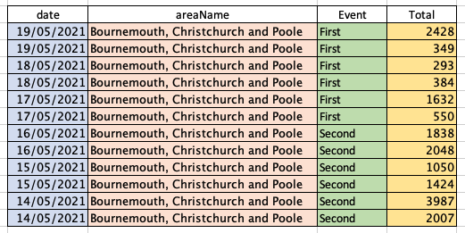
Whereas for R to be able to interpret it and neatly plot the data, it needs to look more like this:
This is the difference between wide data, shown in the upper table, and long data, shown in the lower table. Immediately you can see that the long data is not quite as easy for us humans to interpret – this is why both wide and long data are perfectly valid methods of presentation, but with different use cases.
Column headers containing values instead of variable names is in fact the first common problem of messy datasets described by the New Zealand statistician Hadley Wickham in his paper Tidy Data1Wickham, H. (2014). Tidy Data. Journal of Statistical Software, 59(10), 1 – 23. doi:http://dx.doi.org/10.18637/jss.v059.i10. For interest, the full list of common problems is:
column headers being values, not variable names;
multiple variables being stored in one column;
variables being stored in both rows and columns;
multiple types of observational units being stored in the same table;
a single observational unit being stored in multiple tables.
Thankfully, in the covid vaccination data we only have to deal with one of these problems! As is usually the case in R, there’s more than one way to solve our this particular problem.
We tidyr the data and gathr
To elongate our data, we are going to use the gather function that comes as part of the tidyr package. tidyr helps us create tidy data. In his Tidy Data paper, Wickham cites the characteristics of tidy data as being:
each variable forms a column;
each observation forms a row;
each type of observational unit forms a table.
First off, let’s install tidyr:
install.packages("tidyr")
In our R script we will then need to load tidyr so we can use the gather function:
library("tidyr")
Our data already exists in the dataframe vaccs_combined – as a reminder it’s currently set out in a wide format like this:
> head(vaccs_combined)
        date                            areaName First Second
1 2021-05-19 Bournemouth, Christchurch and Poole  2428   1838
2 2021-05-18 Bournemouth, Christchurch and Poole   349   2048
3 2021-05-17 Bournemouth, Christchurch and Poole   293   1050
4 2021-05-16 Bournemouth, Christchurch and Poole   384   1424
5 2021-05-15 Bournemouth, Christchurch and Poole  1632   3987
6 2021-05-14 Bournemouth, Christchurch and Poole   550   2007
We’re going to create a new dataframe called vaccs_long and use gather to write the elongated data into it. gather works like this:
Hey presto! Our data has been converted from wide to long:
> head(vaccs_long)
        date                            areaName event total
1 2021-05-19 Bournemouth, Christchurch and Poole First  2428
2 2021-05-18 Bournemouth, Christchurch and Poole First   349
3 2021-05-17 Bournemouth, Christchurch and Poole First   293
4 2021-05-16 Bournemouth, Christchurch and Poole First   384
5 2021-05-15 Bournemouth, Christchurch and Poole First  1632
6 2021-05-14 Bournemouth, Christchurch and Poole First   550
I quite enjoy tinkering with data, and the sheer amount of it that the global response to covid-19 has produced gives us a number of rich datasets to explore. In this blogpost I’ll try and set out my adventures in the R statistical programming language to plot the covid case rate in England onto a graph.
To do this I’m using RStudio which is free software available for the Mac (which I use), Windows and Linux, along with the ggplot2 package within R. I don’t have the expertise in any of this to provide a particularly good tutorial in either R or RStudio but there are countless guides, YouTube videos, books and so on available. This is simply the story of my own travails, partly to serve as an aide-memoire but also in the hope that someone else could find it interesting.
I will try to recreate the process of discovery I stepped through on a bank holiday afternoon. I’m conscious that might not be terribly helpful in terms of working out how the underlying code ends up so I’ve published it over on Github in case you would like to see it
Finding some data
First, I need a dataset to work with. Thankfully the Public Health England covid data is easy to obtain from https://coronavirus.data.gov.uk, and the download page allows you to build a URL you can use again and again. Here, I’m using the following parameters (all selected from dropdowns) to build my permanent link:
Area type
Nation
Area name
England
Metrics
newCasesBySpecimenDate
Data release date
Latest
Data format
CSV
As you select each parameter, your permanent link is built for you below. Here’s mine, based on the selections I made above:
You can visit this link in your web browser; it’ll return a CSV file which you can load in a spreadsheet package such as Excel, or Google Sheets and manipulate it that way if you like.
Into R
As I start writing my R code I need to do a few things: first, I need to load the ggplot2 library to enable me to plot some nice looking charts. Second, I need to load my dataset using the URL we built above. And third, I need to plot the data into some sort of meaningful form.
A couple of things have happened here. First off, I’ve loaded ggplot2 as mentioned just above. I’ve also created a variable, covid_cases_csv into which I’ve dumped the covid case dataset by way of the read.csv command which uses the permanent link I got from Public Health England as an argument.
Having run this code I don’t see any particular errors, but I want to make sure we’ve loaded something that R can work with. If I issue the command head(covid_cases_csv) I get back the following:
   > head(covid_cases_csv)
      areaCode areaName areaType       date newCasesBySpecimenDate
   1 E92000001  England   nation 2021-05-02                    674
   2 E92000001  England   nation 2021-05-01                    991
   3 E92000001  England   nation 2021-04-30                   1343
   4 E92000001  England   nation 2021-04-29                   1836
   5 E92000001  England   nation 2021-04-28                   2134
   6 E92000001  England   nation 2021-04-27                   1805
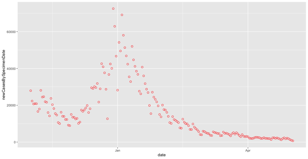
Excellent! We have a working dataset I can use to create a plot. I’ll now issue the following command – am I going to get a beautifully formatted plot?
ggplot(covid_cases_csv, aes(x = date, y = newCasesBySpecimenDate))
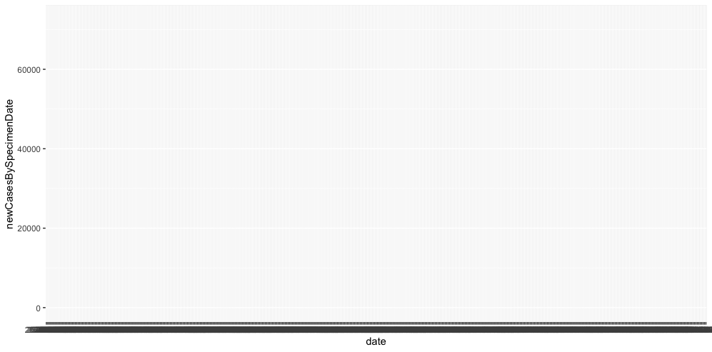
Not quite. I do get an x and a y axis, a few case rate tickmarks and a great many date tickmarks but that’s about it. I need to add what’s known as a geom to actually see any data. I’m also going to create a second variable, covid_cases_plot to hold my ggplot command to make it easier to work with later.
So now my new variable is a receptable for the ggplot command. With the plus mark I can also add the geom_point command to plot my data. And finally, I call my variable to execute the plot.
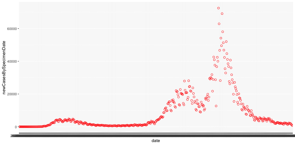
We have some data! We also have a few things to fix, the first thing being the slightly odd date format in the underlying data that ggplot is clearly having trouble interpreting. I’m going to add a couple of lines to my script just after I populate my covid_cases_csv variable which will rewrite the data to a slightly easier format:
# FORMAT DATA ----

covid_cases_csv$date = as.Date(covid_cases_csv$date, "%Y-%m-%d")
That x-axis immediately starts to look better.
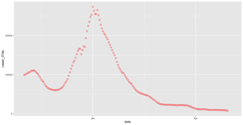
Zooming in and smoothing off
Because I’m mainly interested in the case rate change we’re experiencing in 2021, there’s a lot of early data I can eliminate. I also want to calculate a seven-day average to remove some of the noise in the plot and make patterns easier to establish.
To cut out data prior to 1st November 2020 I need to change my ggplot command to introduce a conditional which argument in square brackets, effectively cutting my plot down to “dates greater than 1st November 2020”:
We can now see the familiar shape of cases dropping off over the November lockdown, only to rise again through December and January. At closer range this is even noisier, so we want to implement the seven day rolling average to calm it down a little. This requires us to add two more libraries, dplyr and zoo to enable us to manipulate the data further. I therefore add the following lines to the # LOAD LIBRARIES section of my script:
library("dplyr")
library("zoo")
Next, I add an additional parameter to my # IMPORT DATASET section:
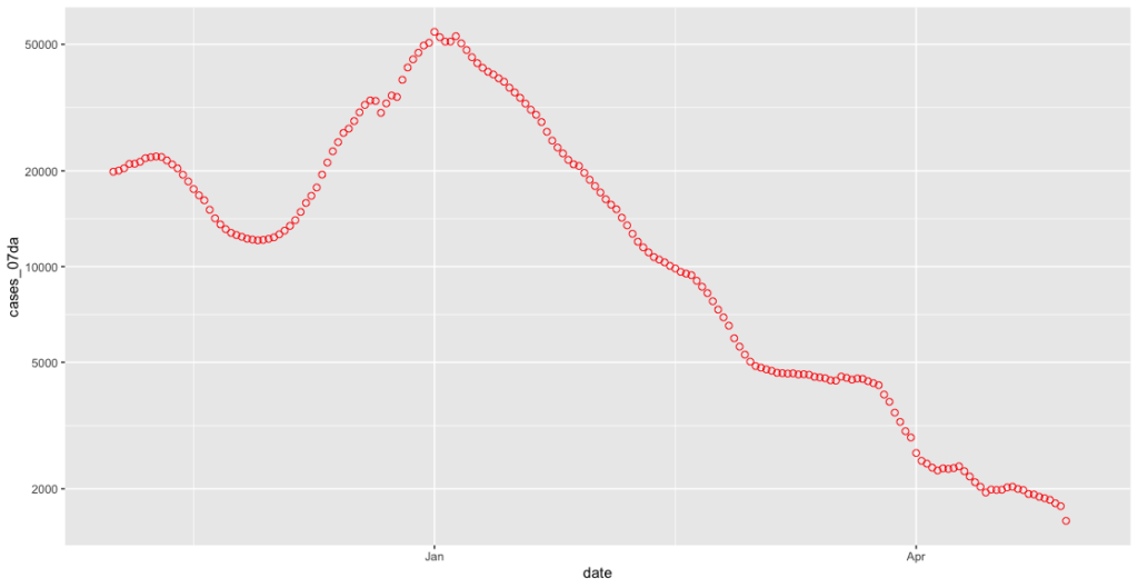
covid_cases_csv <- read.csv(url("https://api.coronavirus.data.gov.uk/v2/data?areaType=nation&areaCode=E92000001&metric=newCasesBySpecimenDate&format=csv")) %>%
   dplyr::mutate(cases_07da = zoo::rollmean(newCasesBySpecimenDate, k = 7, fill = NA))
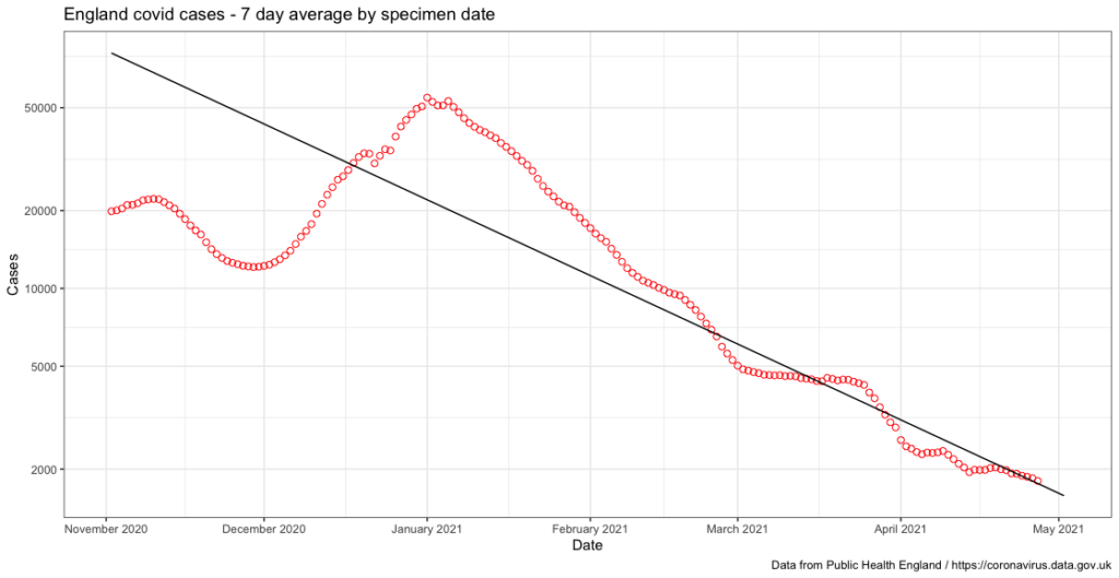
Here I’ve used a function of the dplyr library called mutate, and a function of the zoo library called rollmean to create a 7 day rolling average of the newCasesBySpecimenDate column in my dataset. This produces a value I have named cases_07da and we now need to make sure we plot this on our y axis instead of newCasesBySpecimenDate. Again we change our ggplot command:
Off to the logging camp to see about a dangling end
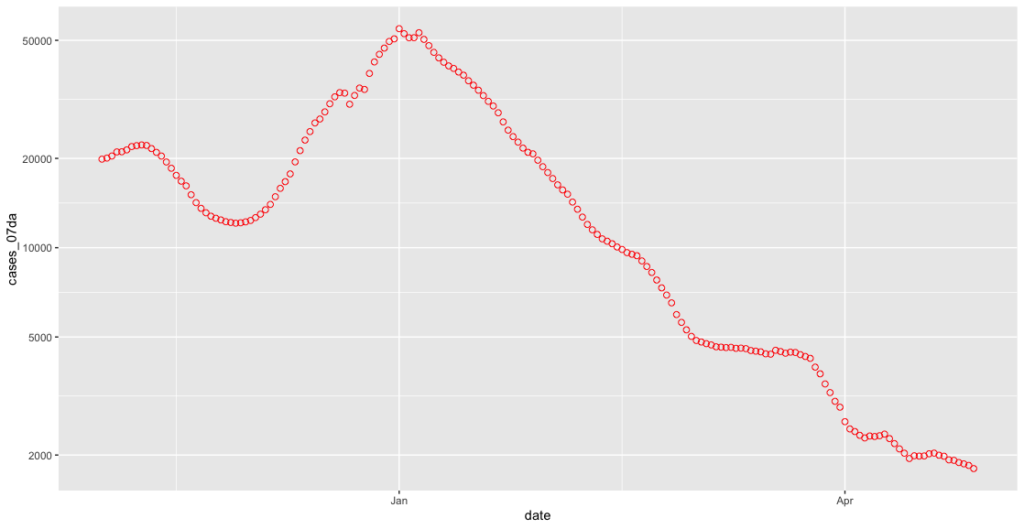
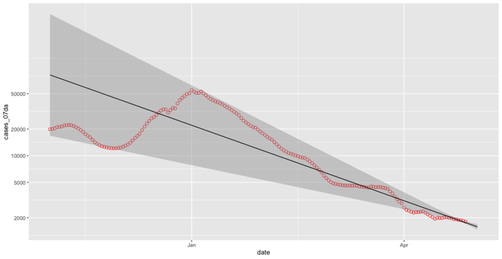
This is starting to look a lot better. However, the linear scale doesn’t really help us chart the case rates given the low levels of the disease present in the UK at the time of writing. A log scale will show this in a rather better way. Let’s add an additional argument to our final line where we call the covid_cases_plot variable:
Now we can see much more easily what’s going on at those lower levels. This improvement has highlighted however a further problem inherent in the “cases by specimen date” dataset, which is that the numbers for each day can be revised upwards as new test results come in. This can theoretically happen at any time, although as Richard @RP131 shows us daily on Twitter this is usually pretty stable after five days:
Chart for monitoring lag in reporting of England positive test results. Each column represents a given day's report and shows which specimen dates it covers. pic.twitter.com/2eyrHOkaJG
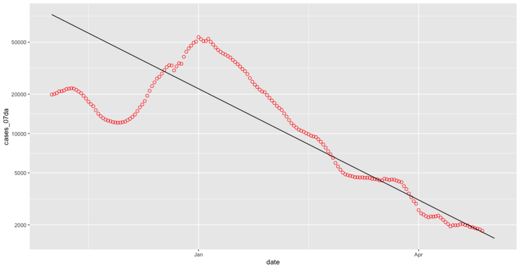
What we therefore want to do is not plot anything from the last five days. It was not immediately obvious how to do this until I discovered R’s Sys.Date() command which returns the date in a way which allows me to perform a simple subtraction on it:
less_recent_days <- Sys.Date() - 5
If I return again to our ggplot command, I now need to add a further statement to my which argument to allow us to cut off the date range at both ends:
Now we don’t have any artificially low rates to concern ourselves with, we can have a go at plotting a reasonably current trendline. This is done in ggplot using a geom called geom_smooth. As we’re looking at a seven day rolling average I’ll use a seven day trendline as well. To figure out the date seven days back from five days ago (remember we’ve chopped off our dangling ends up above), I’ll simply use the output of my less_recent_days variable like so:
less_seven_days <- less_recent_days - 7
The geom_smooth gets added on after the geom_point command. Using the subset argument and our less_seven_days variable we can make sure we only track the trend for the period of time we want. The method of “lm” gives us a ‘linear smooth’, or a straight line.
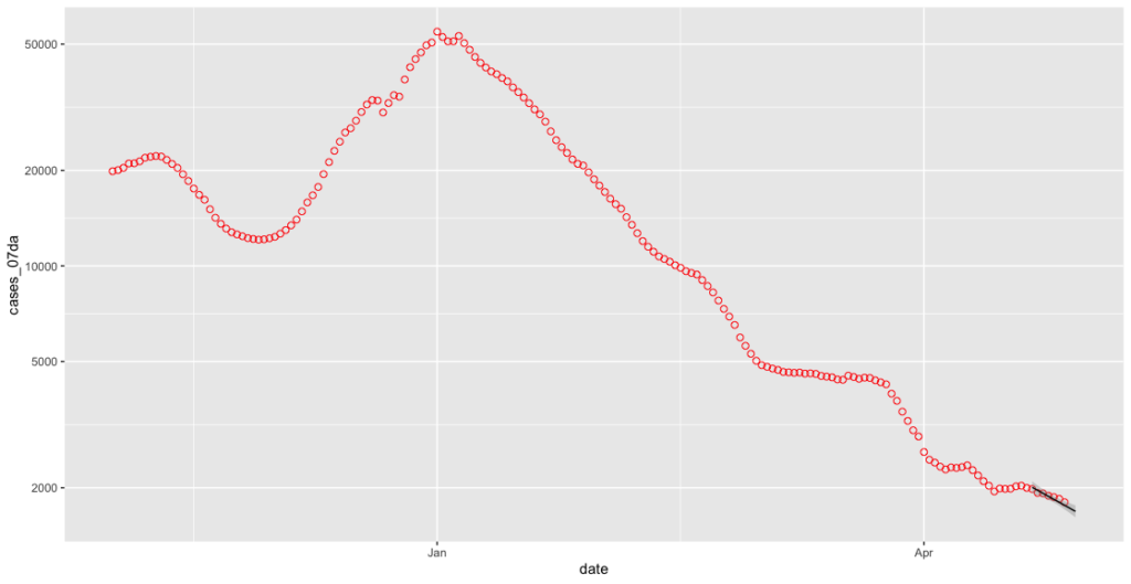
We now have a useful data plot, however it’s still a little rough around the edges. If I add some additional arguments to the final calling of the covid_cases_plot variable I can neatly label each axis, make sure the x-axis shows each month as a separate tickmark, add a title and finally change the style of the plot:
I also add a further argument to my ggplot command to credit PHE for the data:
labs(caption = "Data from Public Health England / https://coronavirus.data.gov.uk")
The final product looks something like this, which I’m pretty pleased about to be honest:
I’ve yet to decide whether or not I do anything with this data – I might try and have a look at doing something similar at a county level for my local area but I’ll leave that for another day.
The end product
I don’t think I’d ever recommend anyone uses any sort of code I’ve written, but if you’re curious about how these various snippets of code ended up you can see them over on Github.
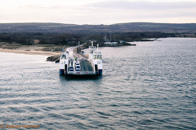
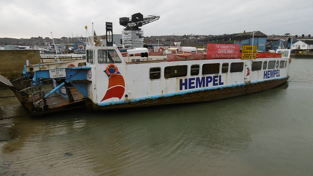
Barfleur, the cross channel ferry from Poole to Cherbourg is not in mid January a very busy ship. The last few days have been cold, with icy rain and the threat of snow, a rarity in the usually mild Dorset climes. Today, however, there is the promise of sunshine, just appearing over the horizon as we get ready to depart. A few minutes early, we head off from the berth into Poole Harbour, for a moment at least heading straight towards the rising sun.
Condor Liberation waits on the other linkspan at the port of Poole, having been unable to sail the previous day as the weather was outside her operating limits.
The route from the port of Poole to the English Channel is not a particularly direct one, and takes longer to traverse than it does for us to eat our cooked breakfasts in Barfleur’s self service restaurant. The harbour channel makes tight turns to get round the twin obstacles of Brownsea Island and Sandbanks. The water is shallow here, and accuracy important. As we round the final turn the harbour mouth becomes visible, the chain ferry linking each bank waiting for us on the Studland side with only a few cars wanting to cross this early on a Saturday.
Bramble Bush Bay waits on the Studland side of the harbour mouth
Bramble Bush Bay makes the crossing over to Sandbanks. Brownsea Island is visible in the background.
As we steam away from Poole out into the Channel I go up onto the winch deck. The sun is now as up as it gets in January and although I am in a reasonably sheltered position the wind is still bitingly cold.
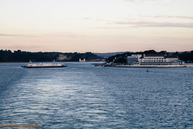
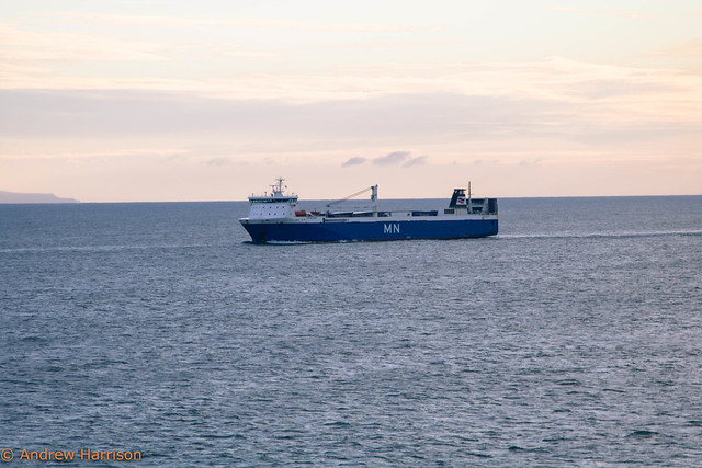
We pass MN Pelican, heading into Poole to take our place on the linkspan to discharge her unaccompanied cargo. On arrival, she will load up with many more unaccompanied trailers and set off for Santander in northern Spain, ensuring productive mileage for those goods on board on a Sunday when most lorry movements are prohibited in France.
MN Pelican approaches Poole with Bournemouth in the background
A slight swell set in as we pressed on. Seats in the restaurant gave way to recliner seats in the lounge, and wakefulness gave way to forty winks as the soporific effect of the rocking motion continued.
Eyes sprang open as we entered Cherbourg’s grand rade, and the public address system ping-ponged to let us know we were arriving. Heading out onto the deck, we were able to get an excellent view of the very thing we had come to see, the fast ferry Condor Rapide fully out of the water and on dry land for her annual refit.
This magic is achieved thanks to Cherbourg’s Syncrolift, in operation since 2001 and capable of lifting a 90m craft weighing up to 4500 tonnes. It is always impressive to see ships out of the water, that which is normally hidden exposed for all to see. It is doubly so to see it in the flesh and at close quarters.
Once on dry land we drove round to the passenger terminal where an outside viewing deck allowed us to get a closer look.
Rapide, the youngest example of Incat’s 86m class of wavepiercing catamarans, was built in 1997 with hull number 045 and has been in service with Condor Ferries, almost exclusively on their southern Channel Islands — St Malo route since 2010. Between 2010 to 2015 Condor operated three of these distinctive craft, having owned her older sisters Condor Express (042) and Condor Vitesse (044) from new (or almost in the case of Vitesse). 042 and 044 were sold to Greek operator Seajets in 2015 and Rapide is now Condor’s sole remaining catamaran.
Despite the welcome sunshine the temperature still does not lend itself to much lingering outside, and we need to set about finding the late lunch we have promised ourselves.
On our return to Barfleur following the usual round of day trip supermarket shopping we observe with interest that the wind has picked up somewhat and is blowing us right into the berth. An on-the-minute departure is complicated somewhat by the need to apply lots and lots of bow thruster to keep us off the piling. As we turn in the inky blackness of the harbour the wind becomes distinctly uninviting and we repair downstairs to the bar for beer, tall tales and an amuse bouche of crisps and peanuts.
The swell picks up a little later and we make the decision to feed in an almost empty self-service restaurant. I have eaten an awful lot of ferry food over the years and most of it is completely inoffensive but impossible to be prosaic about. A curiosity does present itself in the dessert selection however and I buy it, guessing it to be some sort of upside-down cheesecake. Wrong: it is lemon tart, also upside-down. As we hit the recliners for the last couple of hours I ponder whether or not this was intentional, and all of a sudden we are back in Poole, back in the car, and back on the road home.
We travelled from Poole to Cherbourg with Brittany Ferries on a day return. These depart Poole at 0830 and generally give you four hours ashore. The return sailing departs Cherbourg at 1830 and will return you to Poole at 2145. On some days return sailings will depart at 2215 to provide a night crossing to Poole, arriving at 0700 the next day. Check the timetable for further details.
Want to see how a syncrolift works? The manufacturer has an entire YouTube channel devoted to videos about Syncrolifts, but this example, featuring some particularly upbeat corporate EDM has a fairly good stab at it:
I’d been dimly aware that the Cowes Floating Bridge was due for replacement and that it would happen this year, but had no idea of the exact date. Completely unwittingly, I had already made my last ever journey on it just a week ago today, on Boxing Day. On the day I was rushing to catch the Red Funnel ferry to Southampton and didn’t stop to take any photos.
This was a great shame because I had been intending to capture the two passenger cabins, long and narrow along each side of the vessel and open at each end. They were painted in an array of mauves and pinks, on top of which were assorted poems and artwork contributed by local residents and schoolchildren in 2005. It also means the only photos I have of her are from exactly one year before, on Boxing Day 2015.
Travelling on the floating bridge was always an interesting experience. She looks every inch her forty-two years and is noisy, shabby and rusty. But herein lies the charm; the crossing takes a few minutes, not even enough time to sit down unless you are really intent on doing so. It is an in-between space, yet one that acts as a backdrop to the lives of residents, tourists and other travellers.
From Cowes to Cowes
If you’re not familiar with it, you may be thinking that I’m talking out of my hat and that this floating bridge thing looks oddly like a ferry. It is in fact a chain ferry, a floating vessel attached to a pair of chains which are themselves anchored to dry land at each end. The ferry, by way of its motor, pulls itself along the chains in each direction. If, like me you live in Dorset, you’ll probably be familiar with the slightly bigger chain ferry that operates between Sandbanks and Studland.
The Cowes Floating Bridge is rather more modest, and clanks back and forth across the River Medina every ten minutes or so for up to eighteen hours a day. The gap she has to cross varies with the tide between around 250 and 500 feet with the journey itself taking two or three minutes. It’s an essential transport service for pedestrians travelling between Cowes and East Cowes, and a handy alternative for motorists who would otherwise have to travel twelve miles south to Newport to cross the river.
While the existing ferry bears the imaginative name Bridge No. 5 it is in fact the eighth ferry to operate across the Medina, but only the fifth to be commissioned by the Isle of Wight council since they took over the service in 1909. She entered service in 1975 and has transported over sixty million people across the Medina in her service life.
I’m certainly looking forward to seeing the new ferry installed on the chains. Will she also clock up forty-plus years of service? Who can say. But for now we will say a fond farewell to Bridge No. 5.
Every now and again over the last few years Transport for London (TfL) have opened up a select number of disused stations on a ticketed basis. These were so enormously popular, with tickets selling out so quickly that the London Transport Museum has latterly started advertising them to its mailing list subscribers before putting them on general sale. Even then, getting hold of tickets is a competitive business. So when @Ianvisits, a Blue Badge tourist guide in London (who tweets some really interesting stuff, by the way) tweeted about tours coming up later in 2016 I was put on notice.
Missing this time were the usual tours of Aldwych and the Jubilee line platforms at Charing Cross. I’ve been to Aldwych previously and, while it’s an interesting visit, it’s used so frequently for filming and training that it has never acquired the patina of disuse. And while I’d quite like to see the old Jubilee line platforms at Charing Cross I can quite clearly recall them in use so am happy to leave that particular opportunity for a while.
The other tours on offer were Down Street disused station, the Clapham South deep shelter, TfL’s art deco headquarters at 55 Broadway and the disused tunnels at Euston station. All these sites are interesting, and all places I want to visit, but the future arrival of Crossrail 2 and HS2 mean big changes for Euston, and a significant extension to the south west across Melton Street. It was quite possible that the chance to do this tour would not arise again.
Euston’s early history
Euston of course isn’t a disused station, but in the course of its life it has changed beyond all recognition, and it has some quite substantial disused areas. Euston mainline station opened in 1837 as the terminus of the London and Birmingham railway, connecting London with the Midlands. In 1903 the first deep level underground railway, the City and South London Railway, extended their route from Stockwell northward through the City to a new terminus at Euston. At the same time the Charing Cross Euston and Hampstead Railway arrived, on its route from the west end northwards.
Both stations had their own surface buildings at the south of the mainline station, the C&SLR on the corner of Eversholt Street and Doric Way and the CCEHR on the corner of Melton Street and Drummond Street. There was no interchange between lines, each one being owned by a separate company, and any passenger wishing to do so had to leave one station and walk to the other.
Joint facilities
In 1907 the two companies opened a joint ticket hall, lifts and underground passageways to link the mainline station with the two tube stations. This became popular with passengers and the two surface buildings were closed in 1914 when the companies merged as part of Underground Electric Railways of London (UERL). The two railways subsequently became part of the Northern line, with the C&SLR station on the City branch (via the Bank) and the CCEHR station on the West End branch (via Charing Cross).
Modern Euston
By the mid 1960s the underground station was feeling the strain of an ever increasing number of commuters. As part of the redevelopment of Euston mainline station a new ticket hall with escalators down to new interchange passageways made the old joint facilities redundant. The transfer passageway was closed in 1962, with the lifts and access to the City branch closing in 1968. The lifts were removed, the shafts being converted into ventilation ducts. A new shaft was then dug behind the lifts to provide further ventilation to the brand new Victoria line platforms.
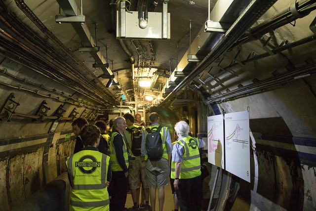
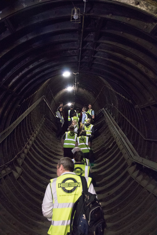
Visiting day
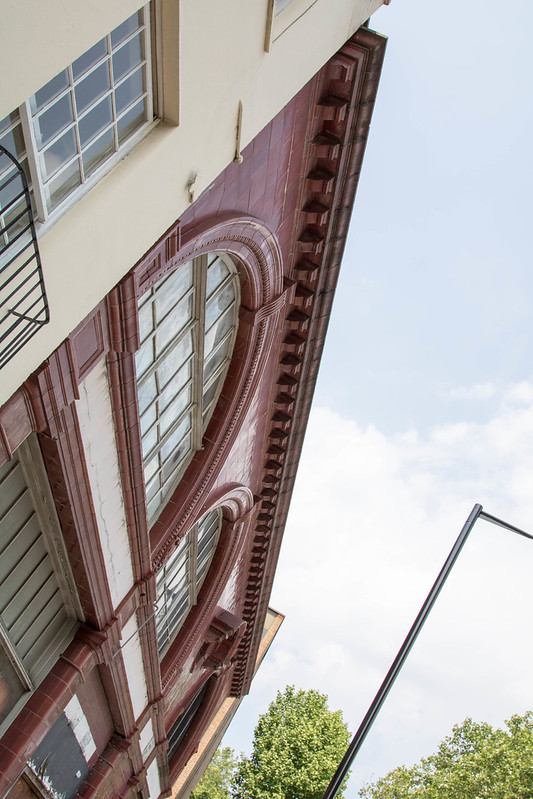
Arriving at the RV point a little early I was able to take a moment to admire UERL architect Leslie Green’s standard station design. There are lots of these dotted around central London and are so familiar they barely merit a second thought, until you have to spend a few minutes lurking around outside one. The recognisable ox blood tiles hide a steel frame, used not only to support the lift gear but, to enable UERL to sell the air rights above their stations, a platform to build on as well.
It’s pleasing to note some of the architectural details, such as this circular window:
Heading inside the station building we were given a safety briefing and a potted history of the site, some of which I have described above. The original fixtures and fittings of the station have long since been removed, the steel frame and lift shafts now housing an enormous ventilation fan. With a 24–105 lens I was not terribly well-equipped to photograph this but this photo hopefully gives an idea of its size.
Down below
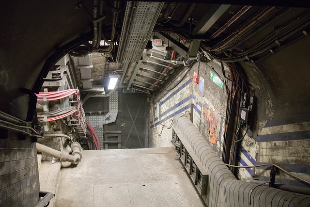
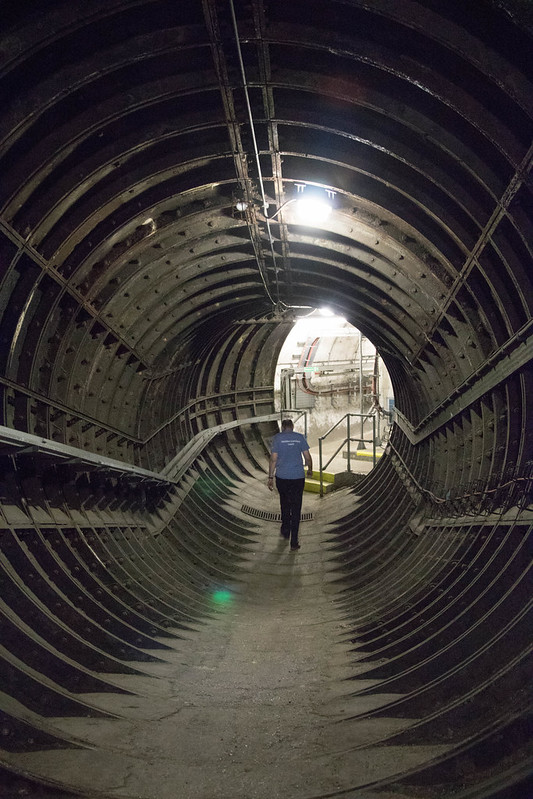
We then headed across the road into Euston mainline station and headed downstairs to platform six. Reaching the end of the platform, our guide unlocked a door in the tunnel headwall and took us into another world. Here we are, looking back down at the door we had just through:
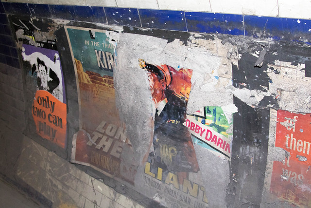
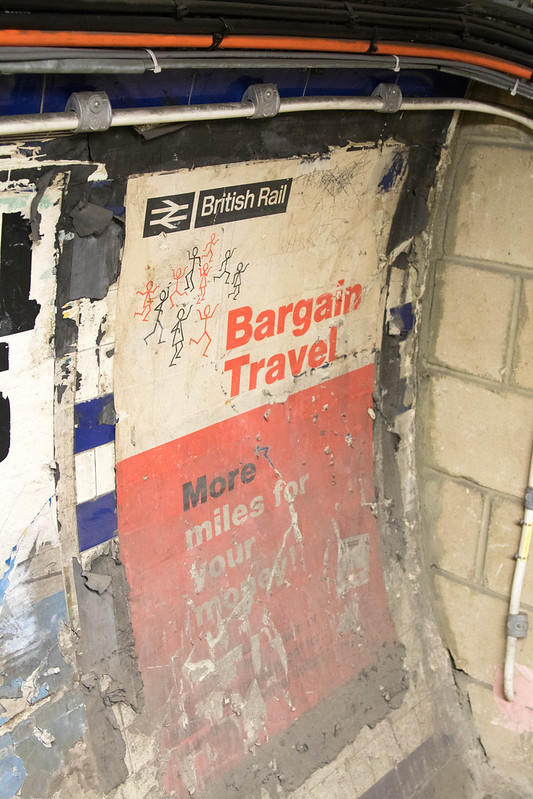
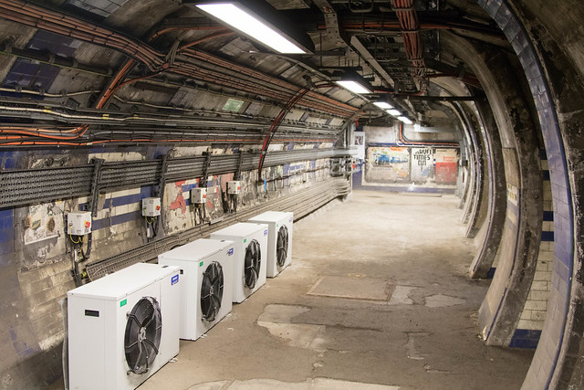
In the disused areas, everything is familiar yet different. Usually polished tiles are dirty, and cables and equipment usually hidden is exposed.
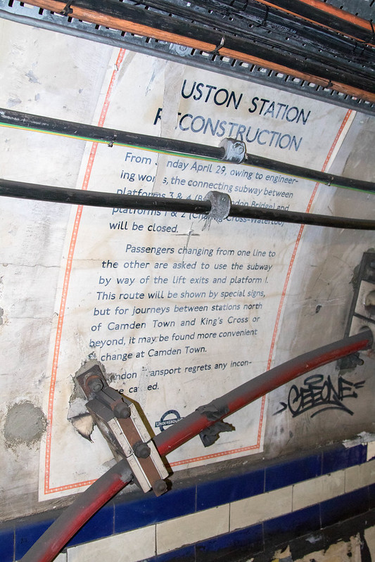
Under the grime and the cables lie time capsules in the form of 1960s posters still on the tunnel walls from the date of their last public use.
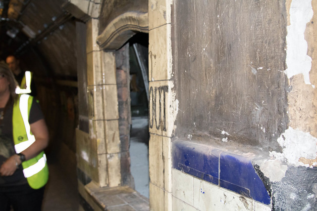
Walking up the transfer passageway, we arrived at the staircase leading up to the Charing Cross branch platforms, now blocked off. When the new interchange passageways were built in the late 1960s they were at a higher level than the platform; the staircase was reversed, and from the platform now leads up rather than down.
At the end of the transfer passageway can be found this oddity, a transfer ticket office dating back to the days of the C&SLR and CCEHR being separate companies. This must have been a very claustrophobic space in which to work.
Returning along the transfer passageway to the stairs down to platform six, we turned left to head along the passageway to the lifts. As an access route for engineering staff this was much better lit than the transfer passageway which is now effectively a dead end.
At the far end of the passageway are the old lift shafts, visible on the right hand side. Cables run over what seems like every available section of wall.
Turning a corner we found ourselves at a modern wall that has been erected across the passageway — we were to go no further along this corridor.
Looking back past the lifts towards platform six:
Walking into one of the old lift shafts we can see that all the lift equipment has been removed, allowing it to function as a ventilation shaft.
On the other side of the lifts we continued down a series of passages before climbing a steep slope to a level above the Victoria line platforms. We were able to look down through the ventilation grilles onto the platforms.
And with that it was time to go, away from this strangely peaceful place back into the middle of busy central London.
2021 update: the Hidden London team at the London Transport Museum have made a video about this area of Euston in their YouTube in their series Hidden London Hangouts: